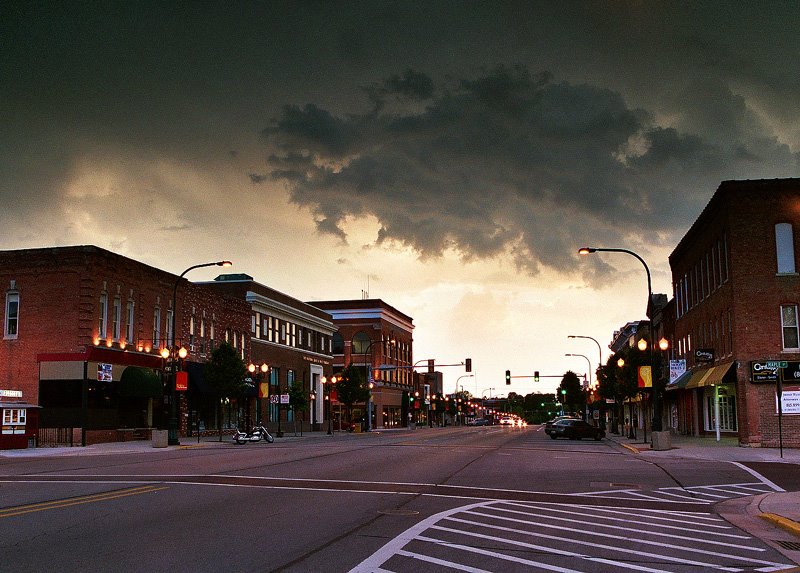
 This photograph appeared on my June 3 post in black and white. At the time I thought it did a better job of capturing the inherent manace of an approaching storm over Sycamore, Illinois. Coming across the original color version, I began to wonder if that really was the case.
I submit it here for a bit of an informal poll. What do you think? Color or black and white? And why?
Click on picture to enlarge. Photograph © 2006 James Jordan.


9 comments:
i like the color version. it seems more original and beautiful.
Both are great.
But I agree with Christine, the colour version is more powerfull. The depth of colour in the buildings is lovely.
I like the color version as well. It has more character than the black and white.
Actually... I think the B&W has a greater capture of menace... the contrasting grades of gray have a more ominous effect on me.
I think the B&W conveys the danger better. My eye is drawn more to the buildings than to the clouds in the color photo.
BV
Thanks, everyone, for giving your opinions. In the end, it appears that every individual tends to see things in their own way, and that's as it should be. And, maybe that's why I tend to stick with color a lot more than I venture into black and white.
Thanks again.
i think the black & white capture the impending danger, but i love the color in this as it is rich and full of depth...i feel drawn in, like the town you are picturing is a place where you would feel comfortable enough to run in a storefront during a rainstorm and they'd be welcoming...
(too much?)
:)
I prefer the black and white version. It seems to be sharper and the individual elements of the image seem to be more distinguishable.
Thanks, all for weighing in with your opinions. My stock in trade with photography is rich, intense colors, so b&w is quite a departure for me, but one I'll continue to experiemtn with.
Post a Comment